01 Overview
What the project was about
FlowAnalytics is an analytics experience that helps workplace teams understand how office spaces are used.
The previous experience gave users access to a large amount of data, but much of it was hard to scan, understand, and act on. My work focused on making the product clearer through dashboard structure, KPI cards, filter logic, navigation, microcopy, visual design, and a lightweight design system.
Role
UX / Product Designer
Timeline
6 months
Platform
Web app / analytics dashboard
Focus areas
Status
MVP designed and implemented
02 Role
My responsibility and collaboration
I worked as a UX / Product Designer on FlowAnalytics over a 6-month period, from research and early exploration to MVP design, implementation support, and handoff.
I was responsible for the UX work across research, dashboard structure, information architecture, wireframes, UI design, KPI cards, filter patterns, navigation, microcopy, design system work, and developer handoff.
The project was highly collaborative. I had regular UX feedback sessions with my supervisor several times a week, where we discussed design decisions, tested ideas, and refined the direction together.
I also worked closely with the product owner and backend analytics stakeholder through weekly product meetings, where we aligned on scope, data logic, user needs, and what was realistic for the MVP. As the design moved closer to implementation, I collaborated with the frontend developer to check feasibility, clarify handoff details, and make sure the design patterns could work in the product.
A key decision point came after the first research phase. I explored broader ways to rethink the analytics experience, including more simplified alternatives. But because the MVP needed to move quickly and still support advanced analysis, we chose to keep the dashboard model and improve it from within.
That meant focusing on clearer structure, better hierarchy, more useful KPI context, predictable filters, clearer navigation, and a more consistent visual system.
03 Problem
Useful data was hard to understand
FlowAnalytics contained a lot of useful workplace data, but the experience had become difficult to scan, understand, and use in daily decision-making.
Users could get value from parts of the analytics experience, especially when preparing insights for meetings, but many dashboards and graphs were rarely used. The problem was not only the amount of data, but how it was presented. The interface felt dense, the visual style was inconsistent, and many KPI cards relied on short labels without enough explanation.
In the previous setup, dashboards could take a long time to load, and it was not always clear when the data was still loading, filters were being applied, or the dashboard was ready to use. Exporting was also slow and inflexible. Users often had to export a whole dashboard instead of one specific graph or view, which was frustrating when they needed material before a meeting.
Navigation also created friction. Some views and tabs were placed in ways that did not match common dashboard patterns, which made it harder for users to understand what was clickable or where to go next.
Because dashboard purposes were not always clear, users often stayed in one or two familiar views instead of exploring the full analytics experience. Filters could also be hard to keep track of, which made it difficult to understand exactly what data was being shown.
The challenge was not simply to show more data. It was to make the data easier to scan, understand, filter, navigate, and act on.
Hypothesis
If FlowAnalytics became more structured, easier to scan, and clearer about what each metric meant, users would be able to understand workplace data faster, use more of the product, and make more confident decisions.
04 Users
Who the analytics experience needed to support
The product supported workplace teams, facility managers, HR, administrators, and people responsible for understanding how office spaces were used.
They needed to understand occupancy, utilization, space performance, and workplace patterns over time. Some users needed quick answers before meetings, while others needed deeper analysis to understand trends and make decisions.
A key user behavior was that many users stayed in one or two familiar dashboards instead of exploring the full analytics experience. That showed that the product needed clearer dashboard purposes, stronger orientation, and better support for interpretation.
05 Process
Research, insight, and design direction
I started the project with a research phase to understand the product, the users, and the business context behind workplace analytics. Since the domain was new to me, I spent time learning the language of facility management, how workplace data is used, and what decisions the analytics experience needed to support.
Research included
- User interviews
- Internal stakeholder conversations
- Analytics pattern review
- Product walkthroughs
- Reviewing the existing analytics setup
- Mapping problems and patterns
- Exploring common dashboard and analytics conventions
- Discussing design directions with my UX supervisor
One important insight was that users did not need more data. They needed a clearer way to understand the data already available.
Many users stayed in familiar dashboards, while other views were rarely used or harder to interpret. This shaped the direction of the redesign: instead of adding more features, the experience needed better structure, clearer language, and more support for interpretation.
Research artifacts
I translated the research into lightweight artifacts that made user needs easier to discuss with stakeholders.
Personas
Summarized two behavior patterns: users who needed quick reporting and users who needed deeper analysis.
Journey map
Mapped the facility manager workflow from opening a dashboard to filtering data, interpreting KPIs, exporting material, and preparing insights for meetings.
Storyboard
Helped frame the meeting-preparation scenario, where slow loading, unclear data states, and limited export created uncertainty.
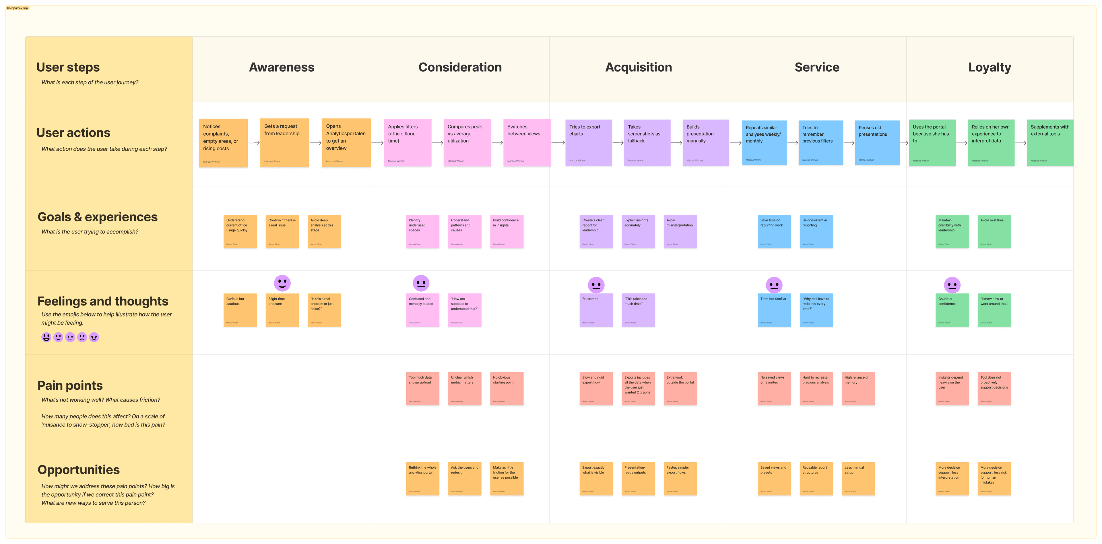
These artifacts connected technical pain points to real user situations, especially around trust, speed, and confidence in the data.
Insight 01
Users needed clearer dashboard purposes
The existing experience included many views, but it was not always clear what each dashboard was meant to help users understand. This made the product feel bigger and more complex than it needed to be.
Insight 02
KPI cards needed more context
Many KPI cards showed a number, but not enough explanation. Users needed help understanding what the number meant, why it mattered, and whether it needed attention.
Insight 03
Filter states had to be visible
Filters were important for analysis, but users could lose track of what was active. This made it harder to trust what data was being shown.
Insight 04
Navigation needed stronger cues
Some navigation elements were easy to miss or hard to understand. Users needed clearer visual cues around where they were, what was clickable, and how different views related to each other.
Insight 05
The product needed a more consistent visual system
The new analytics experience needed to feel like part of Flowscape's own product, not like a separate reporting tool. Consistency, accessibility, and chart readability became important parts of the solution.
Design direction
Early on, I explored more radical ways to simplify the experience, including reducing the number of views or moving further away from a traditional dashboard format.
But through user feedback, stakeholder discussions, technical alignment, and feedback sessions with my supervisor, it became clear that dashboards still made sense for this type of advanced analysis. The better direction was to improve the model users already understood, rather than replace it completely.
- Clearer dashboard purposes
- Stronger information hierarchy
- More helpful KPI cards
- Visible filter states
- Clearer navigation
- Reusable component patterns
- A calmer and more consistent visual system
06 What I designed
The main design work
01
Dashboard structure and hierarchy
I kept the dashboard model because it matched how users and stakeholders expected advanced analytics to work, but improved the structure around it.
Each dashboard needed a clearer purpose, with a stronger hierarchy between overview, filters, KPI cards, charts, and deeper analysis.
This helped make each view easier to scan and reduced the feeling that every chart had the same importance.
- Overview
- Filters
- KPI cards
- Charts
- Deeper analysis

02
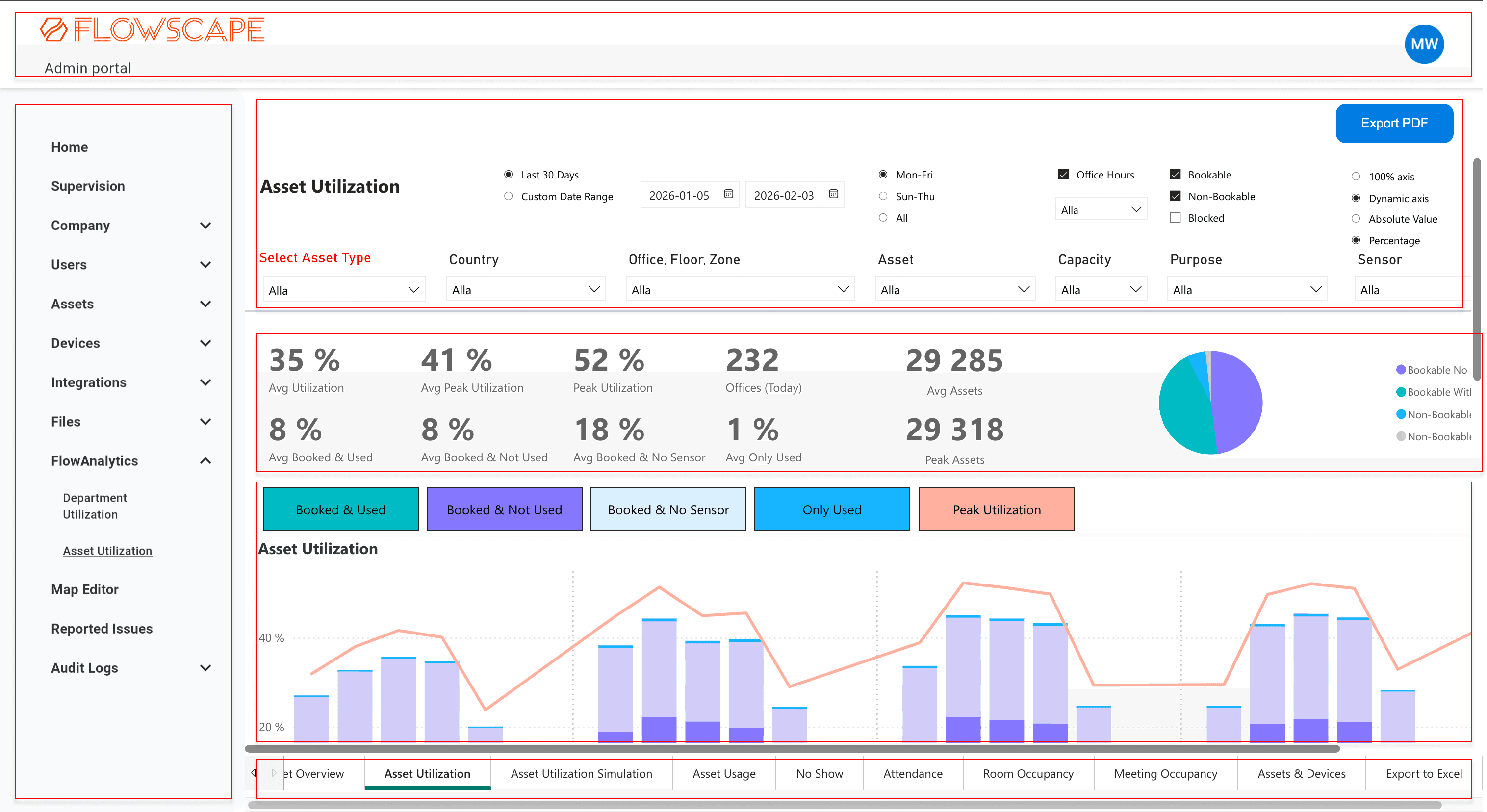
Making filters easier to understand
The old experience made it hard for users to keep track of what data they were looking at. I redesigned the filter experience around a clearer hierarchy.
I designed the filter experience with quick filters and an Advanced filters option. The most common filters were shown directly in the dashboard, while Advanced filters opened the full filter set, including both the quick filters and the more detailed options.
This kept the default dashboard easier to scan without hiding the full filtering logic.
I added an active filter summary that showed what was currently affecting the data. It stayed visible while scrolling, so users did not have to return to the top of the page to check their filter state.
Because data loading could take time, loading states became important. The new experience needed to show users when data was being fetched, when filters were being applied, and when a chart or dashboard was ready to use. This helped reduce uncertainty and made the analytics experience feel more predictable.
- 5 to 6 quick filters visible directly in the dashboard
- One Advanced filters option
- A full filter set that included quick filters and more detailed filters
- Active filters
03
Turning KPI cards into interpretation support
A major problem was that KPI cards often showed a number without enough context. I redesigned them to help users understand what the number meant, why it mattered, and whether it needed attention.
Instead of showing too many metrics at once, the dashboards focused on a smaller set of key KPIs, usually up to four. The goal was to help users scan the most important signals first.
One of the biggest iterations was how to show a KPI in relation to a target. I first explored progress bars, then moved into a gauge-style indicator after stakeholder and customer input.
I explored red, yellow, and green status logic, but after feedback and stakeholder discussions we chose a calmer direction using Flowscape's brand color instead of a traffic-light system. To keep the status scannable, I added a checkmark when a value met its target.
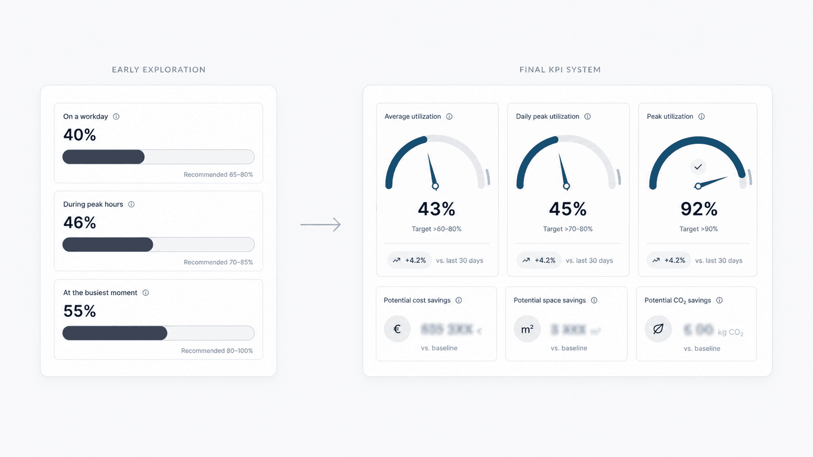
This became a design trade-off: the KPI needed to be clear enough to interpret quickly, but still feel consistent with the brand and avoid making the dashboard feel too noisy.
The KPI cards also included disabled states for cases where required data was missing, helping users understand why a metric was unavailable instead of leaving the card empty or confusing.
- Clearer titles
- Short explanatory subtitles or questions
- Tooltips
- Targets
- Trend indicators
- Visual indicators in some variants
- Disabled states for missing data
04
Improving navigation and orientation
The previous setup made some navigation elements harder to understand than they needed to be. In some areas, tabs were placed in uncommon positions, which made them easy to miss.
I moved tabs to a more familiar position below the dashboard heading, making them easier to recognize as tabs and easier to use when switching between related views.
I also added icons where the difference between sections needed to be clearer, especially in the sidebar and tab navigation. The icons were not added for decoration, but to support quicker scanning and help users understand what each section represented before clicking.
This helped the product feel easier to move through and reduced the need to read every label in detail.
05
Making the simulator easier to interact with
One dashboard had a simulation use case where users could explore how changes in an office setup might affect the results.
In the previous version, the simulator relied on grouped input fields and technical labels. This made the interaction feel more like filling in a form than exploring a scenario.
I redesigned the simulator into separate interactive cards. Each card had enough space for clearer copy, so users could understand what they were adjusting and why it mattered.
Instead of only relying on text input fields, I introduced sliders to make the simulation more visual and easier to explore. The goal was to help users understand the direction and size of a change while adjusting values, rather than forcing them to type a number without much context.
This made the simulator feel more interactive and helped users understand that they were exploring possible changes, not just entering static data.
06
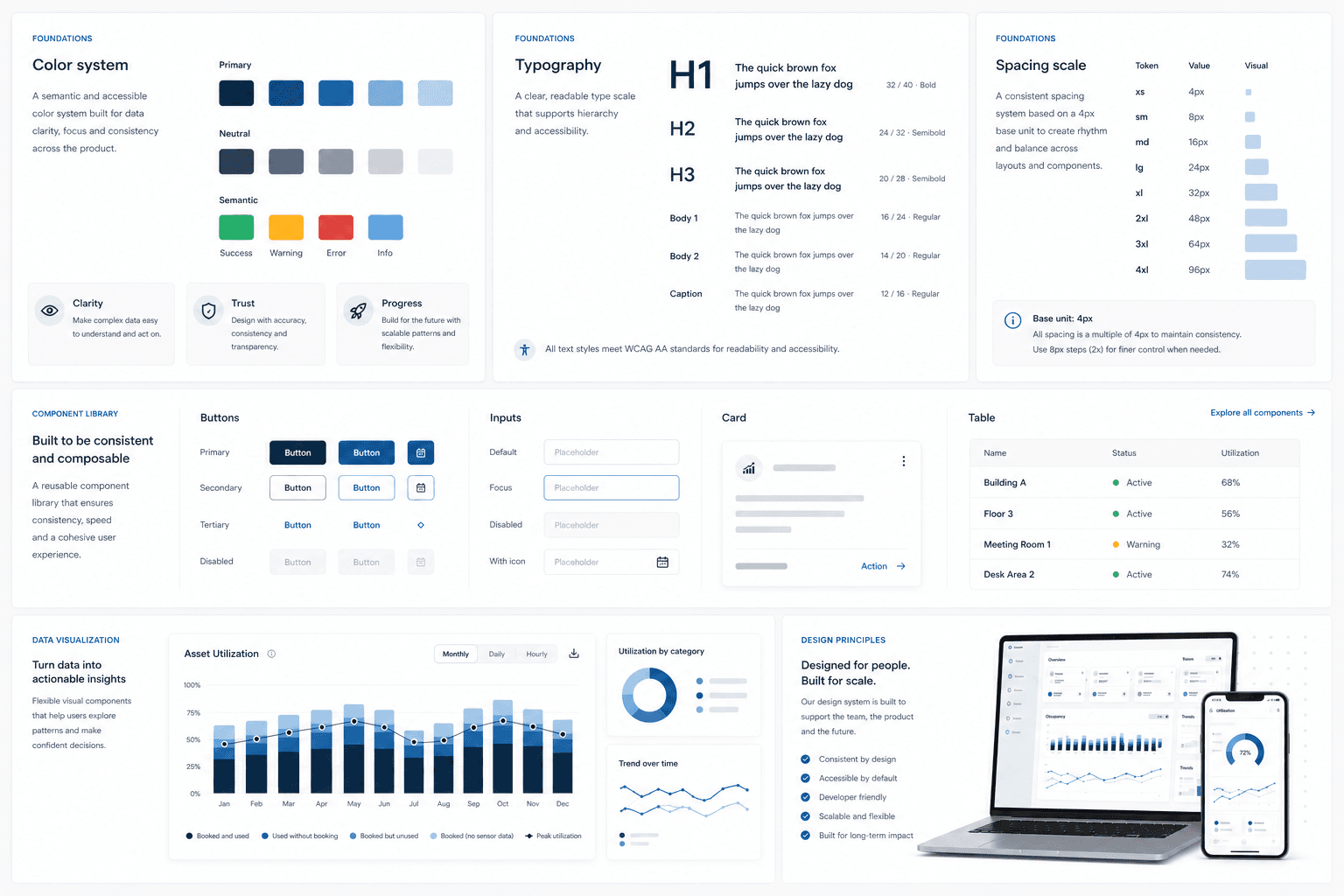
Creating a lightweight design system
Since the new analytics experience was being built as part of Flowscape's own product, I created a lightweight design system for the MVP.
It built on the company's existing product language, but adapted it for a more data-heavy analytics environment.
A large part of the work was making the analytics experience feel clearer, calmer, and more connected to Flowscape's brand. I also focused on accessible color choices and chart readability, especially because analytics can quickly become visually overwhelming.
- Colors
- Typography
- Spacing
- Rounded cards
- Buttons
- Loading states
- Disabled states
- KPI card patterns
- Filter patterns
- Chart styling
- Reusable components
07
Export touchpoints
Exporting was a known pain point in the previous experience. Users often needed to bring specific charts or dashboard views into meetings, but the old export flow could be slow and too broad. Instead of exporting only what they needed, users often had to export a whole dashboard.
Part of this was solved through the technical rebuild, but I also helped shape cleaner export touchpoints in the interface, including dashboard-level export and chart-level export options. This gave users more control over what they exported and made the experience feel less like one large all-or-nothing action.
07 Results and learnings
What changed and what I took with me
The project resulted in a new FlowAnalytics MVP with 5 redesigned dashboards, a lightweight design system, reusable component patterns, design files, prototypes, and developer handoff material. The designs I delivered were implemented into the new analytics portal.
For users, the new experience made workplace data easier to scan, navigate, and interpret. KPI cards gave more context around key numbers, filters became more transparent, navigation became easier to understand, and the visual system made the product feel more consistent.
Testing and feedback indicated that the new direction was easier to understand and navigate, but because user testing happened late, some findings became recommendations for future iterations.
This was one of the reasons Flowscape wanted to move away from the previous Power BI-based setup and build FlowAnalytics as part of their own product. The new setup gave the team more control over performance, export logic, frontend patterns, and the overall user experience. My UX work built on that opportunity by improving clarity, feedback, structure, loading states, export touchpoints, and the overall experience.
Internal feedback was positive. My supervisor highlighted my role in making complex data easier to understand and use for decision-making, adapting to a fast-paced MVP environment, aligning with stakeholders, creating clear developer handoffs, and exploring AI as a way to iterate more efficiently.
“Marcus played a key role in improving an analytics platform, focusing on making complex data easier to understand and use for decision-making.”
What I learned
This project taught me how to design in a real product environment, where user needs, business goals, technical constraints, and time all have to be balanced.
As the main designer on the project, I got to work through the full design process: research, analysis, structure, prototyping, UI design, stakeholder alignment, handoff, and iteration. It made me more confident in making design decisions, asking better questions, and explaining why UX decisions matter.
I also learned how complex analytics UX can be. A dashboard can contain valuable data and still be hard to use if the structure, labels, filters, navigation, and visual hierarchy are unclear.
In this project, copy became especially important. When a metric or chart could not be changed completely, better wording, tooltips, targets, trends, and clearer interaction patterns helped make the information easier to understand.
Working with stakeholders also taught me how important it is to listen carefully, document decisions, and separate ideas from actual user needs. Users and stakeholders often suggest features, but the real design work is understanding the problem behind the request.
What I would do next
- Run usability tests earlier and more often, especially after the first dashboard was ready.
- Explore saved filters so users could return to important views faster.
- Explore custom dashboards for teams with recurring reporting workflows.
- Test export flows more deeply around meeting preparation.
Next case study